by Niels Weijenberg
Whereas a brushstroke can immediately reveal a painter’s hand, the even expression of a printed line discloses less about the creative process of a print. There are, however, other ways one can get closer to the printmaker. In this short blog, I would like to share some of my findings on the making of an intriguing print from the early modern Low Countries: the letter A from the print series Nova alphati effictio.

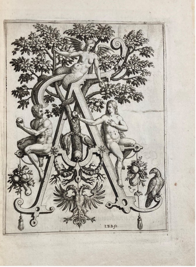
The engraving shows the Fall of Adam and Eve. Remarkably, it is situated at a larger-than-life capital letter A, which is ornamented with garlands, fruit trophies, and the heraldic crest of the Habsburg Empire. Holding the apple from the Tree of Knowledge, Adam and Eve are about to break God’s rule, an action that would be punished by expulsion from the Garden of Eden. A devilish figure with snake legs on top of the letter encourages them to persist. In the shape of an eagle, God’s presence is represented at the foot of the letter.
Before discussing how this print was made, a few words of introduction about its context. Nova alphati effictio was published in Frankfurt am Main in 1595 by Theodor de Bry and his sons Johan Theodor and Johan Israel.[1] Father De Bry had fled his native Liège to escape war and religious intolerance. In Frankfurt, an international centre for the trade of printed books and images, the De Brys established a highly successful publishing house, known for its sophisticated book illustrations.
Nova alphati effictio shows the letters of the Latin alphabet in a highly symbolical manner. It connects each letter to a Biblical figure or religious concept. Furthermore, each letter is adorned by myriad animals and plants, as well as playful grotesque creatures. As a whole, the series presents an emblematic representation of the divine perfection of the written word – the power of God and the beauty of his creation manifested in letters.
The print series is a central case study in my PhD project, which explores visual print culture addressing debates on the origin and perfection of writing in the sixteenth- and seventeenth-centuries Low Countries. Last year, I wrote blog about printed Netherlandish calligraphy, which forms another corpus of images central to my dissertation.[2]
Drawing the print
Most early modern Netherlandish printmakers made their engravings after drawn designs on paper. This could be made by the printmaker him/herself, or provided by a professional painter.[3] Often, these drawings were on the same scale as the intended print, so that the image could easily be transferred. The picture was drawn and engraved in reverse, so that it would ultimately be oriented correctly. Preparatory drawings often had little value as autonomous artworks in their day, but a few have survived, typically only those of the most established draughtsmen. Yet those that have, provide an intimate insight into printmaking.
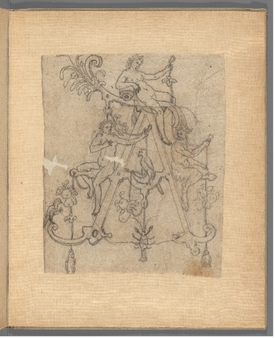
In this case, the drawing unveils a drastic change in the print’s design: the De Brys initially envisioned an alphabet inhabited by satyrs, putti and nymphs, not characters from the Holy Scriptures. The design for A shows different animals and bundles of fruits and leaves. Having said that, just as remarkable is the fact that the postures of these figures are identical to Adam and Eve’s. Although this question is too big to answer here, something or someone must have persuaded the artists to choose a different fashioning of the alphabet.
Looking at the print itself
During my fellowship at the Herzog August Bibliothek in Wolfenbüttel, Germany, I discovered that some copies of Nova alphati effictio have very light scratches in the images, underdeveloped lines I later recognised as the printmaker’s contour sketches on the plate. These lines were lightly engraved to help the artist plan out the plate – a technique one could compare to a painter’s underdrawing. Due to their lightness, underdeveloped lines of dismissed elements dissolved quickly after the print was put to use. Therefore, this can usually only be seen on early impressions of an engraving.
The Wolfenbüttel copy of letter A shows many examples of such underdeveloped lines. The foliage and roots of the Tree of Knowledge seem to have been imagined more extensive than the final execution shows. This suggests Habsburg crest is a late addition. The bar on which Eve is seated was intended to be decorated with a ribbon. The apple in Adam’s hand is round in the sketch – but through its uneven shape, the final version wants to stress that Eve had already taken a bite from the apple, which enhances the sense of a chronological sequence of events within the scene.
In conclusion, it is clear this print had a lively production process. The De Brys departed from their initial concept and gradually refined their images through additions and curtailments, during the drawing phase up to the execution of the printing plate. It is through observations such as these that one can fully appreciate the art of print.
Niels Weijenberg is a postgraduate researcher in Art History at UoM.
[1] The most comprehensive study on the De Bry publishing house is: M. van Groesen, The Representations of the Overseas World in the De Bry Collection of Voyages (1590-1634), Brill 2008.
[2] https://manchesterarthistory.wordpress.com/2022/07/04/fieldnotes-from-the-museum-early-modern-netherlandish-calligraphy-by-niels-weijenberg/#_ftn1
[3] A. Griffiths, The print before photography: An introduction to European printmaking 1550-1820, The British Museum 2016, esp. p. 34-38.
